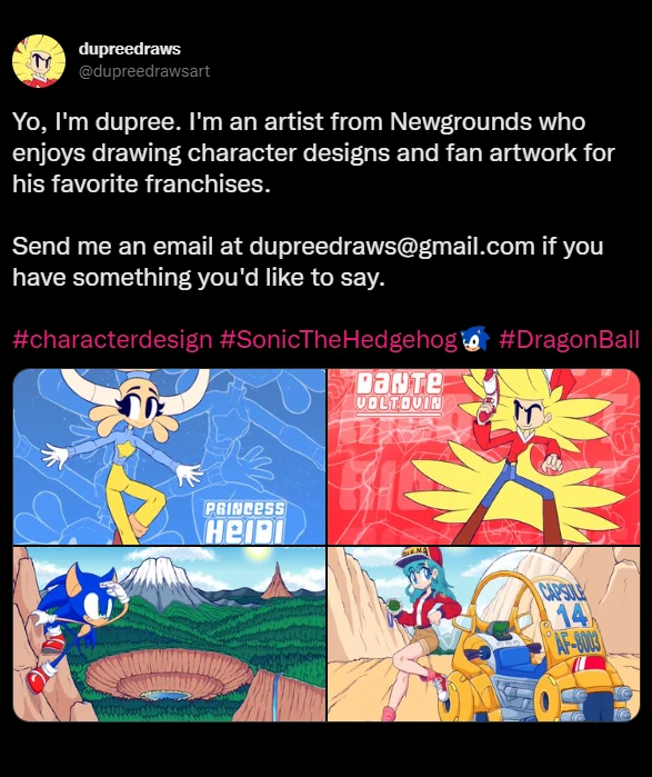

Six years ago today, May 25th of 2017, I decided to create my Newgrounds account.
This was initially done to have a place to upload the games I make. Though as you can probably tell, game creation is no longer the focus of dupreedraws. However if I were you, I wouldn't give up the possibility of that focus returning just yet.
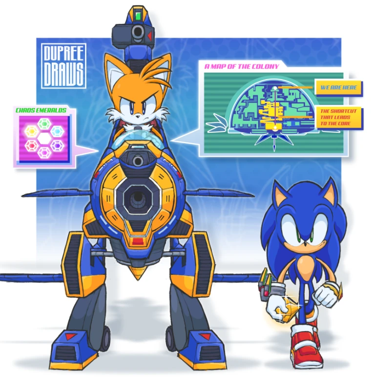
But that's not the point of this post. The point is to celebrate this occasion and the "Three Talents" you see above.
I put "talents" in quotes, because I feel that this word has turned into one that gives people the wrong idea.
And that's the idea that a noteworthy efficiency or exceptional aptitude within a particular skillset is something that people are born with—a gift from God that you had no choice but to inherit—brought to you in a neatly wrapped package.
And sure, some of us have our brains slowly molded in a particular way that makes certain activities more appealing to us than others. However, I don't believe that this idea should be used to dismiss the hard work and effort that is involved in dedicating your time and energy to developing a skill.
What may look like a born gift with a particular skill is, in reality, just the tip of the iceberg. An iceberg of failure, regrets, struggle, blank pages, dead ends, disappointments, dissatisfaction, you name it. But for most of us, we don't see the whole iceberg. We just see the peak, the final result.
That said, I still chose to call this banner "The Three Talents". Because "The Three Skills" doesn't quite roll off the tongue the same, now does it? Lol.
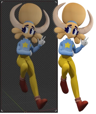
All jokes aside, I always have to face this fact with every new talent I try to learn, and I especially had to face it during the creation of my latest 3D model of Heidi.

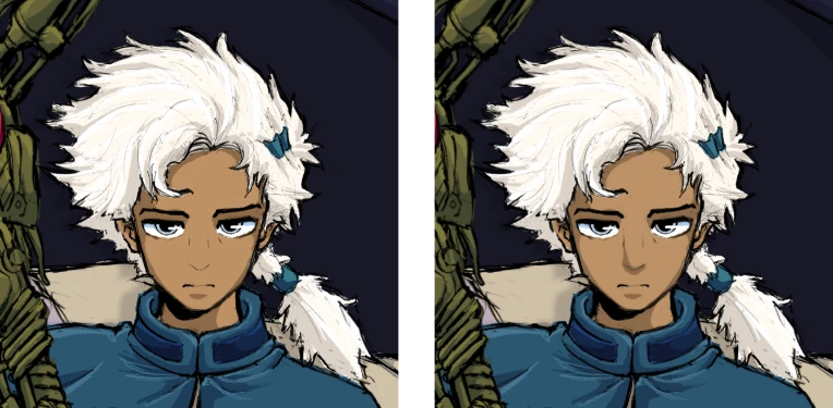
(Rendered Preview on the left, Final Render on the right)
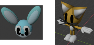
Ever since I was little, I've always had an interest in 3D modeling. I vividly remember downloading a copy of a program called DAZ3D Studio and making small little basic models of the characters I created. I had no concept of how to export a render, what a polygon was, what a vertex was, or anything like that. I was just adding shapes into the scene and manipulating them to vaguely resemble what I wanted them to be.
While I unfortunately don't have the models I created in DAZ3D, I do have the honor of showing you the screenshots of the models I created of those characters in Blender not too long after that on my old PC. And from this, I think you can get a pretty general idea of what it looked like.
By all means, feel free to point and laugh. I'm doing it with you.

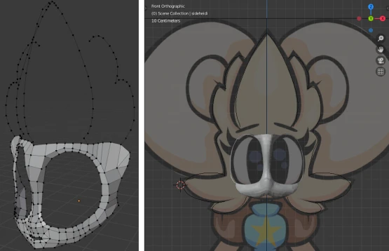
It was only years later, around 2019, when I wanted to take 3D modeling more seriously. I downloaded a copy of Blender on my new computer, loaded up a bunch of tutorials on Youtube, and tried to make a model of none other than Heidi herself. She was a very new character at the time, and one I took to be much more three-dimensional than the others, which was why I chose her to model.
And so I did, over the course of several days. Polygon by polygon, face by face, one vertex at a time.

Except for the fact that I gave up at the face.
Though the words "freakish" and "horrific" come to mind, I actually don't regret this.
However, it turns out that I had severely underestimated the amount of work that goes into making a 3D model. Especially making it look good, and especially for a more complicated character like Heidi. Yet, I persisted, though not for very long, and didn't end up getting past the face.
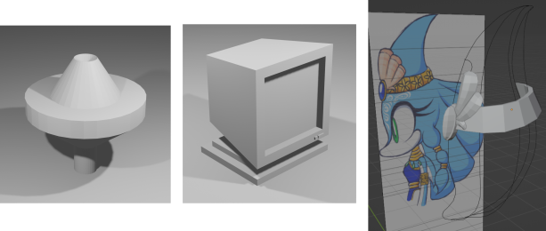
And in the coming years, I left the modeling world at that. Reopening Blender about once or twice every one of those years, trying and failing to make something that I thought was exceptional, let alone finishing it.

(Renders of basic unfinished objects from 2020, unfinished character wireframe from early last year)
Though I may have failed to make something I thought was exceptional, or to fully finish a model I had created, in reality, these attempts were not failures. With each attempt, I was slowly building my understanding of the fundamental concepts of blender, slowly learning how to navigate the software, slowly learning the things I could expect from it, and eventually, eventually, I got better.
My biggest problem was that I was creating my models from scratch, polygon by polygon, very slowly.
While this is an effective process for some, it was a laborious and tedious one for me. It was only recently that I discovered that my true passion for 3D modeling was to be found best in sculpting.
Sculpting a high-poly model as opposed to doing it polygon by polygon really takes away alot of the work-load involved in 3D, especially in creating more organic shapes. And while it does come with its own swath of limitations, it is still exponentially more preferable to me than "modeling by hand", so to speak, unless in an extremely particular instance like creating hands (which is something I'd rather model by hand than sculpt).
Ultimately it comes down to whichever you prefer the most, and what exactly your end goal is. Having a variety of ways to tackle a single problem while still being able to arrive at one solution is most of the fun that's involved in this line of work.

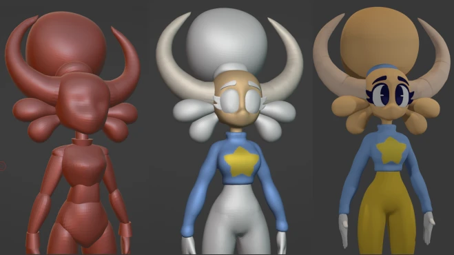
(Early Matcap screenshot, mid-texture painting, first model render)
I first began modeling Heidi in around March, working continuously on it for about a week straight until I finally had the final sculpt. However, when I had tried rigging the model, I hit a dead end. I couldn't figure out how to make it work with the tutorial that I followed. In it, they took their base sculpt and remodeled the whole thing by hand in order to get good topology so that the model wouldn't break when posing.
And in assuming that I too had to do that (even though I didn't), combined with the fact that I have a bad history with modeling by hand (even though I could've), I decided to put the completion of the model in indefinite hiatus, hoping that at some point I would eventually decide to put up with it and tackle it once again.
It turns out, of course, that I did not have to re-topologize the entire model in order to get a properly functioning rig. And though my rig is not perfect, I don't think going over the model again polygon by polygon would solve its problems.
It was only recently that I decided to continue my progress on it again, once I was brainstorming how I could replace my old banner. For quite a while, I've felt as though my banner didn't accurately reflect where I was at artistically/skill-wise.
My style had long since evolved past that look, and as one of the first things people saw when they visited my profile, I felt like it was important for others to know very quickly what exactly I'm capable of, what I am like, and the kinds of things that appeal to me.
At first this began with the idea of simply just redoing each illustration of each character and then putting them all together in a single image. However, even that idea didn't feel like it fully captured the scope of what to expect from me.
I've always wanted my art to be a combination between many different mediums, software, and techniques. Not just purely illustration or purely graphic design, but using both together in harmony with one another to create something unique.
I wanted to take that idea of updating it to showcase where I was at artistically and take that to the next level—to crank it up to 1,000. And the more I thought about it, the closer I got to the "Three Talents" banner idea.

(First thumbnail-sketch on the left, uncropped final banner on the right)
The sketch was created before I resumed working on Heidi's model, so I knew that I had to finish it and its rig if I wanted to make this banner. As well as creating other props that I needed and adding small details.
Heidi's base design was slightly modified during the creation of her model, and I wanted the rest of my characters to follow suit.
The monkey in the middle, Kiki (lol), came easy. I knew full well how to update her design from the previous banner and turn it into one that more strongly supported the appeal of the character. To do this, I examined her very first iterations and took note of what made them so appealing.

(First idea-sketch of Kiki, first pixel art of Kiki's final design, vector art of Kiki, illustration of Kiki)
As the newer one of my characters, she has the advantage of having many readily accessible design-sketches and a clearly visible throughline with each design. She's one of the ones who are most fresh in my mind.
Despite this, I felt like there was a very strong sense of appeal that was present in her earlier designs that I just wasn't quite able to capture every new time I drew her. Some were too cute, some were too sharp, and some were too... long?
And it is for this reason that I thought she was the weakest of the three drawings in the previous banner.

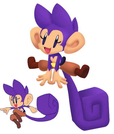
(Final art of Kiki with the original drawing in the bottom left corner)
The older design slowly began to feel more and more like too much of a departure from what I liked about the character, so I wanted to take her back to her roots and make her more appealing.
With the results of this back-to-basics approach, you would think that I would approach the same problem for Dante in a similar way. However, this was not the case.

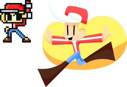
(First Dante sprite in the top-left corner, very old Dante vector art from 2019)
As the current mascot of dupreedraws, Dante's design is very important to me. However, his design is one that I think has been both relatively unchanged yet somehow drastically altered at the same time, in a way that I cannot say the same for virtually any other character of mine.
Because of this nature, his image—his "feeling"—is one that is very particular and difficult to get right. It's not like I'm not allowed to deviate from his base design, though at the same time I can't stray too far from the path, or else I will tamper with the feeling with the character.
In fact, Dante was a very interesting case, because his design had already been updated between the creation of the old banner and the creation of the new one, with a very speedoru-inspired look.

I knew I was no longer satisfied with what I had before, but at the same time, I didn't know where to begin.
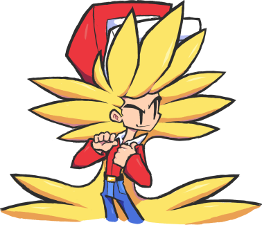
I had several new directions I wanted to take with the character. I wanted to make him more of an old-western cowboy/sheriff type. I wanted to give him new shape language—hair like a Christmas tree instead of the 3-pronged diamond shapes. I wanted to "apply logic" to his design by making his hat and hair smaller, thinning his eyebrows, et cetera, et cetera.
However, judging by the reactions I got to the concepts of his new designs, I could tell that I was departing too far from my image of the character, and especially the one that others held that image to be. The things I perceived as illogical flaws in his design, others saw as exactly what they loved about him.
It was because of this disconnect that I decided to sit down and really rethink the necessity and severity of the extent to which Dante needed to be redesigned. And through that process, I ended up coming closer and closer to the final design present in the banner today.

(Old design on the left, a few of many redesign concepts in-between, final design on the right)
In the redesign process, I relearned things I had forgotten about the character, picked up new elements and ideas along the way, and gained a new understanding of his character that made me appreciate him in a way I hadn't before, which all ended up making its way into the look and feel of the final design. Relatively unchanged, yet drastically altered.
I tore my boy down and built him back up only to end up exactly where I started.
And honestly, I do not regret it at all.

Boy, that was a long one. Time to wrap this up.
The process of making things you are truly happy with comes with what is often years and years of trials and tribulations that others tend to cast aside in favor of the final result. Even I had to brush past a few details for the sake of brevity, and this blogpost still ended up being longer than I expected.
Still, nothing of high attainment comes easy.
To prove this, I decided to walk you through just what exactly I've had to go through in order to achieve the things I wanted to do; to show you the ugly iceberg that lies beneath the surface. Hell, even my six years on this website isn't the whole of that iceberg.
I made this post in hopes that it'll reach some of you out there who may want to pursue a talent or refine your craft, but have run into so many dead-ends along the way that you’re asking yourself if you should keep trying anymore. I already know there are a few of you out there. I too asked myself that question in pursuit of this "third talent", and I'll still ask myself that question with other dreams I chase in the future.
Though to that I tell you this: If you not only fully believe in an idea, but fully believe in yourself, then I promise you, you can do anything.
Iteration is key. Start off small, and work your way up to the top. You’re not alone. There are people out there who are walking the very same path as you that are willing to help you along the way.
Thank you for reading this iceberg of a post LOL. Thank you for supporting me along the way.
And here's to another great year.
Have a pleasant evening.

